John Hogg
Branding & Art Direction
John Hogg began as flax traders in 1890 and became one of the world’s leading manufacturers of solvent soluble dyes and marker chemicals for the petroleum industry. They hold approx 50% Market share of the European Dyes Market.
They commissioned a full re-brand to affirm their global presence, and highlight their world-class services and solutions.

The Chemistry to drive success.
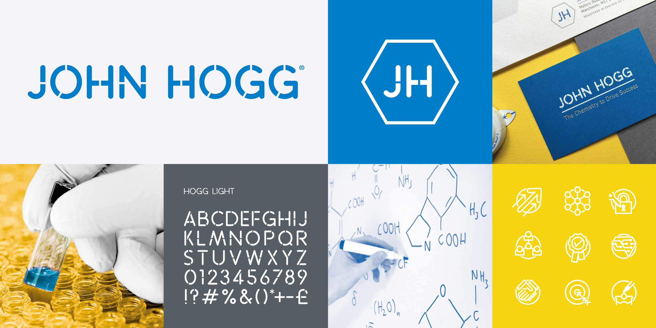
Our design process commenced with a focus on Chemical equations, which served as the foundation for the distinct identity of the John Hogg brand. The hexagonal structures inherent in these equations were instrumental in shaping the monogram (below) and determining the angles of the cut-throughs featured in the John Hogg stencil logo (above). Additionally, these hexagons act as a framework for our imagery, creating a hive-like arrangement.

As part of the branding initiative, I developed a bespoke font that drew inspiration from the word mark. In addition, I crafted a series of icons to complement the brand's visual identity. To further bolster the brand's aesthetic, I curated a comprehensive library of stock imagery that was colour-graded to align with the blue, yellow, and grey brand colours.
The brand Guidelines book was ring bound and featured a debossed hexagon cover with white foil monogram. The pages were given an angled cut to the corners to further emphasise the hexagon theme.


